Warrior Code
MVP-to-v1 redesign of a mobile-first social platform for martial artists. Design system, key screens, and information architecture.
Warrior Code came to me as a rough MVP that needed its first real version: a mobile-first social platform for martial artists. Training logs, community feed, gym pages, news. My job was to take the loose early build and make it coherent, consistent, and actually shippable.
The process: research first, low-fidelity mockups to validate structure, refinement rounds, then high-fidelity design with stakeholder feedback throughout.
I looked into how the martial arts community actually talks about training online, forums, subreddits, YouTube comment sections, existing fitness and combat sports apps. The consistent thread: martial artists don't want a generic fitness app with a new coat of paint. They want something that understands the culture, the hierarchy of belts, the relationship between student and coach, the value of technique and discipline over ego.
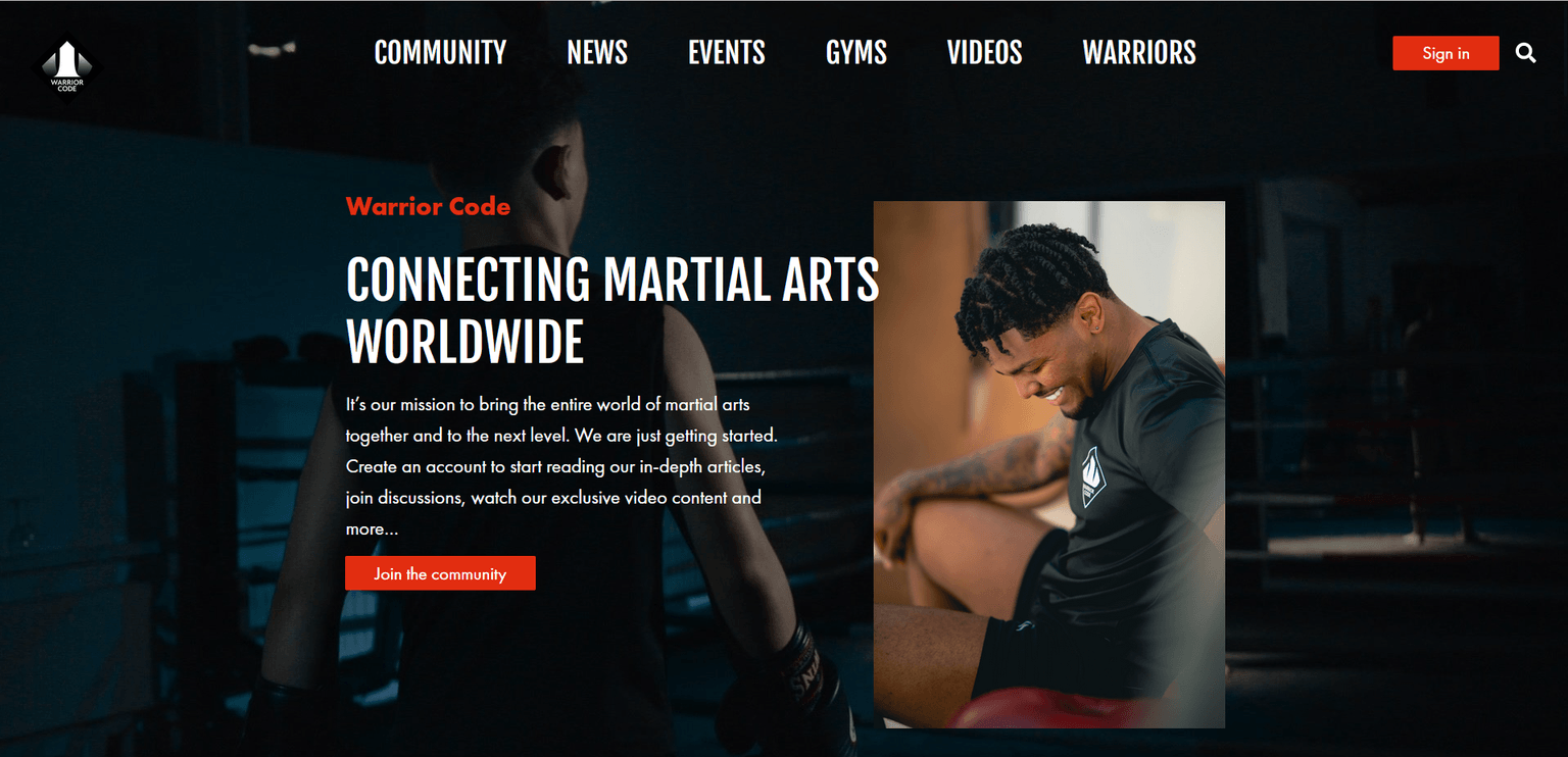
That research shaped every visual decision too. The color palette, red, black, and white, isn't arbitrary. In martial arts these colors carry real weight: black represents mastery and discipline, white represents the beginner's mindset and respect for the practice, and red brings intensity and fighting spirit, the color of competition corners, warning flags, and earned rank in several disciplines. The palette doesn't try to look like a martial arts app. It draws from what martial arts actually means to the people who practice it.
I started with a customer journey map covering the three core flows: new user onboarding, gym owner setup, and social engagement. Getting that down first meant the team and I were aligned on where the friction was before anything got designed around it. From there, the sitemap followed naturally, locking the full product structure before touching any screens.

Then design system first. Components and tokens locked before anything else, that's what kept the rest of the work fast and consistent.


Login and onboarding set the tone from the first screen. Clean, focused, nothing over-designed.


The feed, news, and events pages leaned into content-first. The community's posts and updates should be the product, not the interface around them.


This project taught me a lot. Designing a social platform means thinking in repeatable units, the post card, the reaction bar, the avatar and metadata header all need to work in a feed, on a profile, in a notification. Componentizing for that kind of surface area is a different challenge from a marketing site or a dashboard, and it pushed me to be more systematic about how I built the design system. I also came away with a genuine appreciation for how much cultural specificity matters when you're designing for a passionate niche. Martial artists know immediately whether something gets their world or not. There's no faking it. The research wasn't just useful background; it was what made the branding feel earned rather than applied.